Google Ranking Factors: What You Need to Know
August 25, 2021
The Definition of SEO and its Importance
August 25, 2021Reasons Visitors Hate Your Website
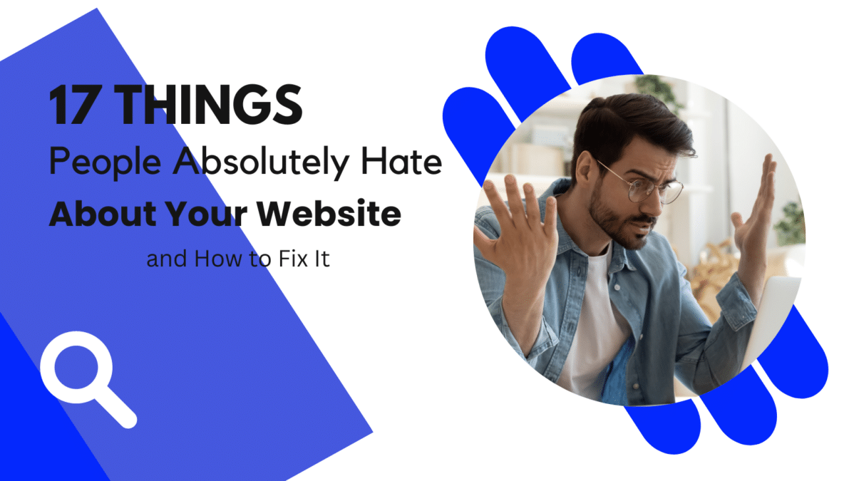
17 Things People Absolutely Hate About Your Website and How to Fix It
Have you ever visited a website and it was hard to find what you were looking for? The menu bar was hard to see, there were 5 million ads, and a pop-up every time you moved your mouse? Pretty annoying, huh?
Every day, we see websites that just don’t work. That’s why Advent Trinity specializes in designing websites that won’t annoy people, are easy to navigate, and get you ranked on the top search engines.
Poor user experience can cause high page abandonment rates, low visitor-to-lead conversion rates, poor organic search listing positions, and a plain ol’ bad reputation. Yikes! This hurts your business big time.
We have compiled a list of the 17 most annoying things we’ve seen on websites to act as a sort of guide for what not to do when designing your website. Let’s take a look at the worst offenders!
Reasons Visitors Hate Your Website
It takes forever to load
Short attention spans aren’t just making us check our phones several hundred times per day; they’re also making us really impatient when it comes to waiting for websites to load. According to a KISSmetrics report, 47% of consumers expect a web page to load in two seconds or less, and 40% abandon a website that takes more than three seconds to load. Even a one-second delay decreases customer satisfaction by about 16%.
According to an Ericsson study, the longer it takes a website to load, the more website visitors blame the content provider instead of their service providers.
But if you want people to stick around your website, you’re going to have to put optimizing your site’s load performance at the top of your to-do list. Advent Trinity is happy to do this for you — it can be quite the process.
It isn’t optimized for mobile
When browsing the internet on a mobile phone, have you ever been forced to scroll from side to side to read copy on a website? Or have you had to pinch-to-zoom because the words or buttons on a page were way too small? These are all examples of the painful User Experience (UX) people can have on websites that aren’t optimized for mobile.
Google announced a major mobile algorithm update in the summer of 2015 that penalizes websites that aren’t mobile-friendly, and it would strengthen the ranking signal from mobile-friendly websites in 2016.
If your site isn’t optimized for mobile devices, you’ll likely lose out significantly in the organic search rankings.
It offers poor navigation
When someone lands on your site, do they know what to do? Where to go? What their next steps should be?
Research by Small Business Trends suggests that 80% of small business-to-business (B2B) websites lacked a call-to-action — as recently as 2013. They weren’t missing out on leads and sales because their CTAs were poorly written; they were missing out because they simply didn’t provide any direction on their website or ask people to click around.
Include clear headline copy, jargonless page copy that explains the value of what you do, and a clear primary call-to-action that shows visitors how to take the next steps — whether that’s subscribing to your blog, getting a free trial, watching a video, or any other action you hope visitors will perform on your site.
It uses excessive pop-ups
Excessive pop-ups that disrupt the reading experience can be seriously annoying — especially when the call-to-action (CTA) copy is made to guilt-trip you. You know, the ones that include a button that says something like, “No thanks, I don’t want to improve my website.” Can’t they just let you live your life?
Other Annoying Things About Your Website
- It contains multimedia content that auto-plays
- It has too many disorienting animations
- It’s littered with generic or cheesy stock photography
- It contains a contact form, but no additional contact information
- It has an unintelligible ‘About Us‘ page
- It doesn’t clearly explain what your company does
- It contains keyword-stuffed copy
- It’s missing social sharing buttons on the content
- It doesn’t have a blog
- It employs titles and headlines that are incongruous with your content
- It displays call-to-action copy that doesn’t align with the offer
- It contains internal linking that isn’t user-friendly
- It displays image sliders that take forever to load
Correcting Your Website
Whew! That’s a lot of annoying things!
At the end of the day, the reasons people hate a website can actually be seen as opportunities for improvement. Whether it’s slow loading times, confusing navigation, or just plain old boredom with your content, we can use these critiques to make your website better.
Want to make your business’s website less annoying and more profitable? Do a website scan for FREE.
